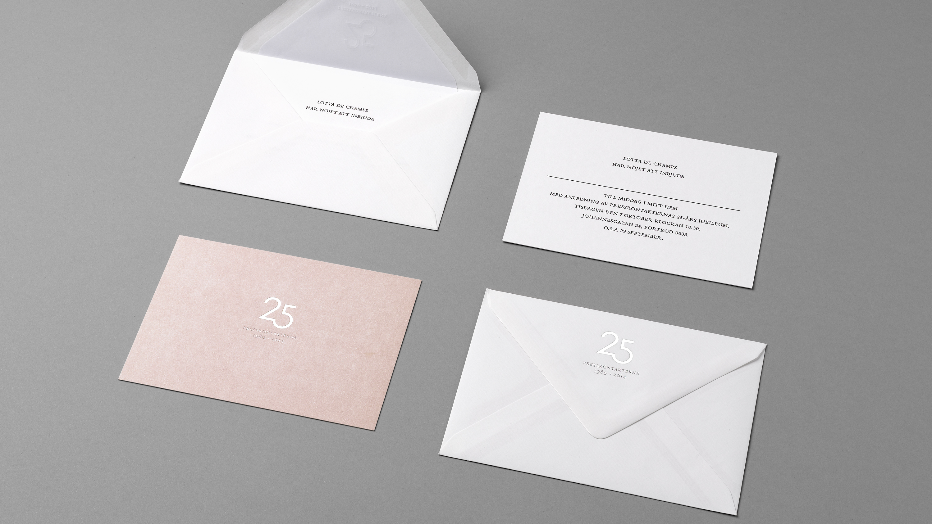
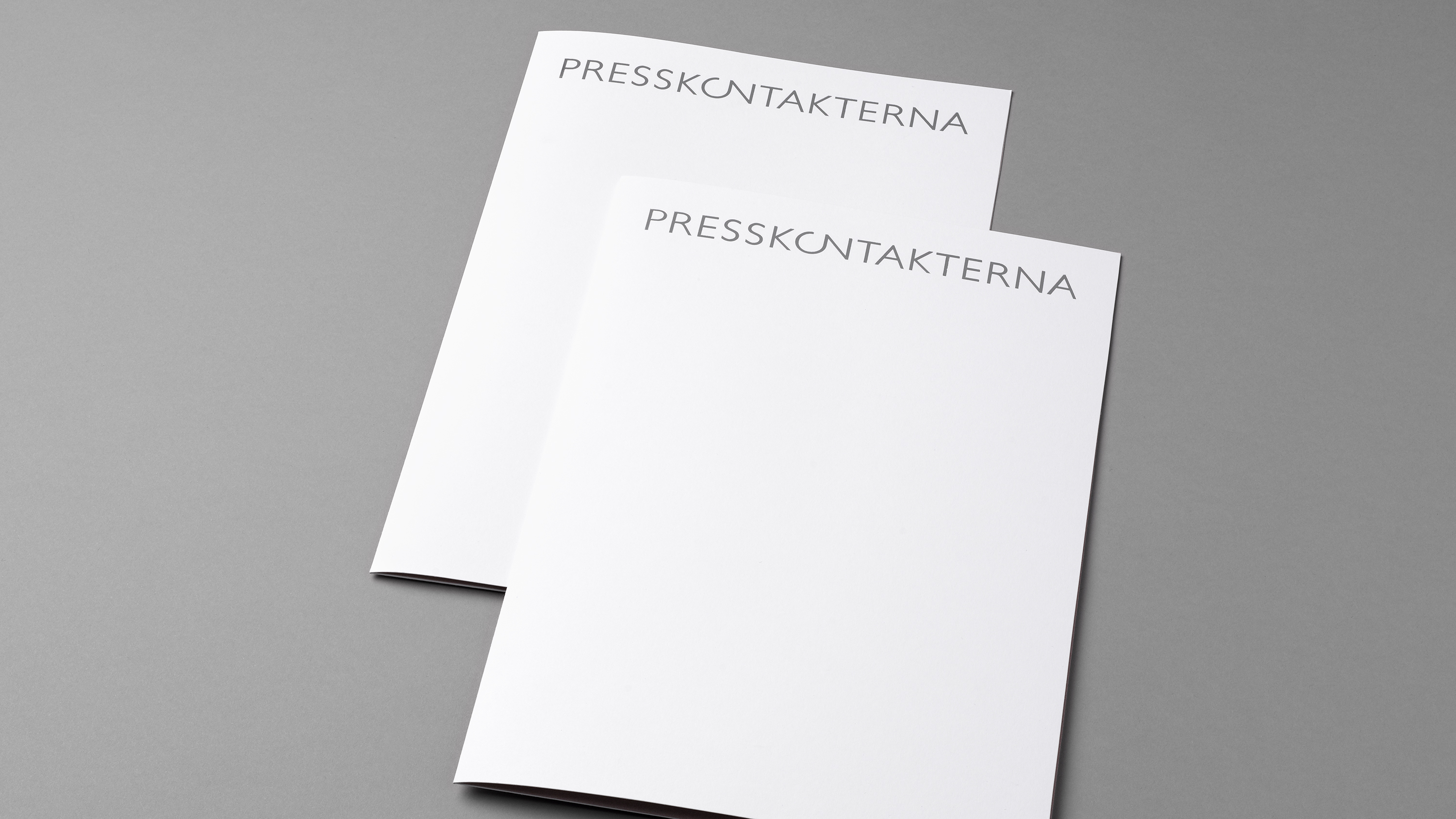
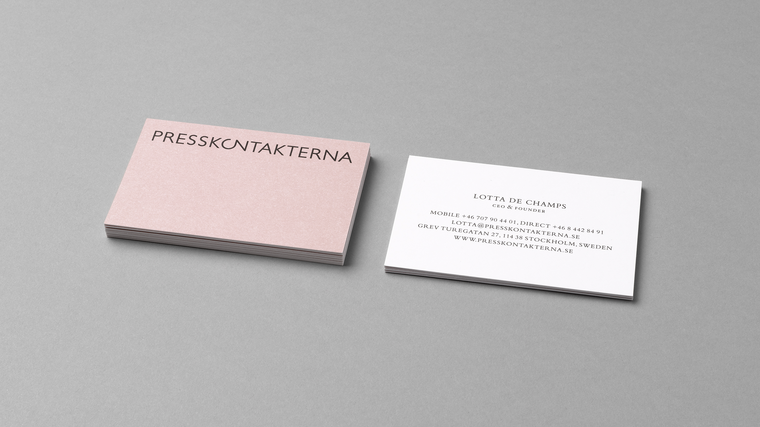
For their 25th anniversary PR Agency Presskontakterna decided to update their brand identity, and at the same time create a symbol for the anniversary. We worked with the existing logotype which was well known, but lacked in clarity. The logotype was redrawn slightly bolder, and we used black typography overall to give a bit more punch. Still holding on to one of the favourite colours – pink. The typography was changed to the more elegant and fashionable Bembo – all set in capital letters.